


Dulux Colour Forecast 2027 Image Credits
Photographer: Lisa Cohen
Stylist: Bree Banfield
The Dulux Colour Forecast 2027 reveals the colours and finishes expected to influence residential painting projects over the next 18 months. Use these insights to inform customer conversations, support colour recommendations and uncover new project opportunities.

Every year, the Dulux Colour Forecast provides insight into the colours, finishes and design directions expected to influence Australian homes. The 2027 forecast has three palettes, Play, Treasure and Sensory, reflecting a growing desire for homes that feel more personal, comfortable and connected to everyday life.
Understanding emerging colour trends can help you have more confident colour conversations, make recommendations during the quoting process and stay ahead of the colours customers are likely to be drawn to over the coming year.
According to the Dulux Colour Forecast team, warm neutrals are continuing to grow in popularity. Each palette this year has a warm white. The forecast also notes homeowners are increasingly seeking spaces that feel more personal, expressive and human. Using colour can be a great way to encourage a customer to lean into their own personal style.
Across all three palettes there are a few blue shades, we predict blue will start gaining popularity in a similar way green has in the last 5 years. The greens have started to shift with a slightly warm buttery undertone and berries and cherries will remain popular as accent tones to inject personality to a space.
For painting projects, that means continuing demand for:
The Play palette is all about creativity, flexibility and self-expression. It combines calming blues, muted lilacs, spearmint greens and vibrant accent colours to create interiors that feel energetic and approachable.
When discussing colour options with customers, it can help to suggest starting with smaller more private spaces such as bedrooms, studys and bathrooms. It’s a great way to experiment and build colour confidence.
Use some of the mid-tone colours such as Spring Fever or Stately Frills Half, these are fantastic broadwall colours that allow introducing colour without overwhelm.
The forecast also highlights growing interest in in colour capping, using a different colour on the ceiling to the walls. An easy rule of thumb is to suggest colours with a similar undertone this helps the space feel cohesive.
Hand painted details, patterns and decorative elements incliuding simple stripes, geometric shapes or colour-blocking techniques can help customers personalise a space while creating additional project scope.
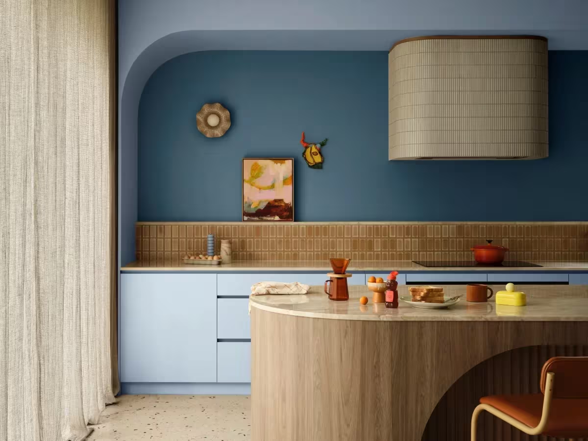


The Treasure palette embraces deeper, richer colours and reflects a shift away from minimalism towards interiors layered with character and individuality. Deep blues, berry tones and jewel-inspired colours create a sense of depth and sophistication.
This palette creates opportunities to discuss colour drenching, this is where the walls, ceiling and trims are all painted in the same shade. This helps make the room feel considered and enveloping.
One of the standout trends within this palette is the renewed interest in high gloss finishes. Used strategically on walls, ceilings, cabinetry or architectural features, high gloss can add light reflection. This is really important when using deeper tones, to ensure the room feels light and atmospheric.


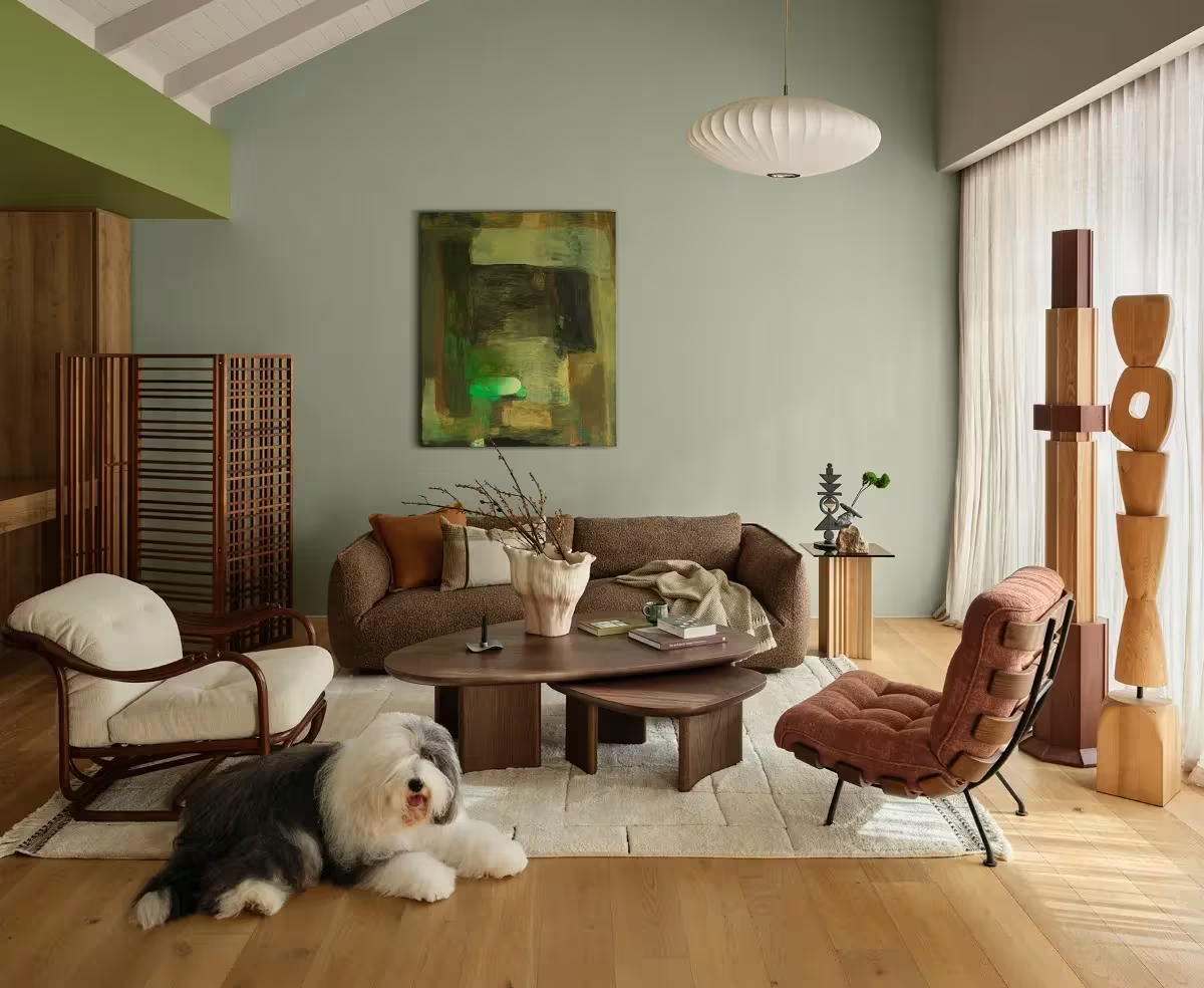
The Sensory palette focuses on creating spaces that feel calm, restorative, and connected to nature. It combines botanical greens, warm neutrals and rich brown tones to create interiors that feel grounded and welcoming.
These colours are well suited to whole-home repaint projects, living rooms, bedrooms, open-plan spaces with connection to surrounding gardens. As customers continue moving away from cooler greys and stark whites, warm neutral palettes like Sensory provide an easy way to create a softer, more inviting look throughout the home.


Understanding colour trends is not about following fashion. It is about helping customers make confident decisions and showing them possibilities they may not have considered.
These palettes are also a starting point tool. It can help you understand what your customer does and does not like. An example – they might be drawn to Blue Balm, but want something just a bit softer. So you could look at the Dulux Atlas, find Blue Balm and navigate up the page for a lighter tone.
Many customers start by asking about a single room or feature wall, but colour trend conversations often open the door to broader discussions about adjoining spaces, whole-home colour schemes and complementary colours.
The Colour Forecast highlights growing interest in finishes that create atmosphere and depth. Discussing finish options early can help customers achieve the look they are after while potentially increasing project value.
Lighting can dramatically affect how colour appears. Encouraging customers to trial colours before work begins can help avoid uncertainty and improve confidence in the final colour selection. It also helps the customer feel confident in their colour decision.
Not every customer wants the latest trend, but discussing what is popular can be a useful way to start a conversation and narrow down colour choices. The most successful colour schemes are the ones that suit the customer, the home and how the space is used.
The Dulux Colour Forecast 2027 provides a valuable snapshot of the colours and finishes expected to influence residential projects across Australia. From playful pastels and uplifting accents through to rich statement colours and calming neutrals, these palettes offer useful talking points when helping customers choose colours and plan their next painting project.
